Problem
Institutional investors do not suffer from a lack of data — they suffer from fragmentation, latency, and cognitive overload. Each morning begins with hours of manual reconciliation across dashboards, risk tools, market news, and analyst research before any meaningful analysis can occur. This workflow delays insight, erodes confidence, and shifts attention away from decision-making toward information gathering.
Solution
I started with interviews, chatting with users while doing a Contextual Inquiry of the current system. The limitations became clear watching each user pivot from one application to another, including having to run calculations in Excel before getting anywhere close to actionable intel. Multiple users would scribble notes on Post-its in between swivels, too, trying to carry data from one application to another. Clearly an area for improvement.
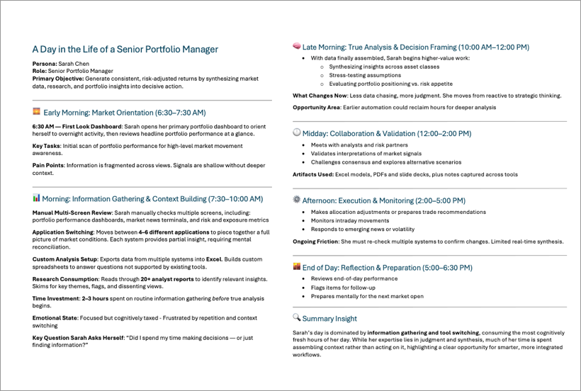
I documented the users' workday in a "Day in the Life" document, capturing the multiple application issues in the process, also seeing how the Alpha platform was part of their overall workflow.
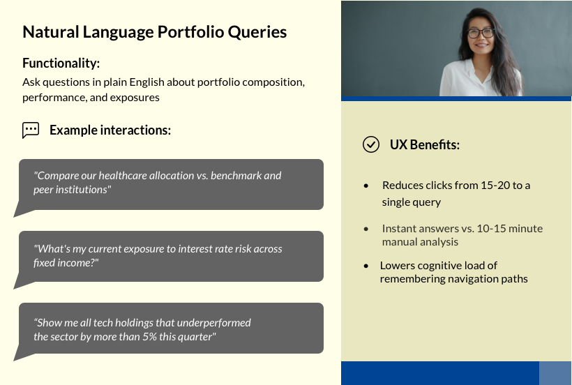
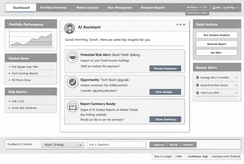
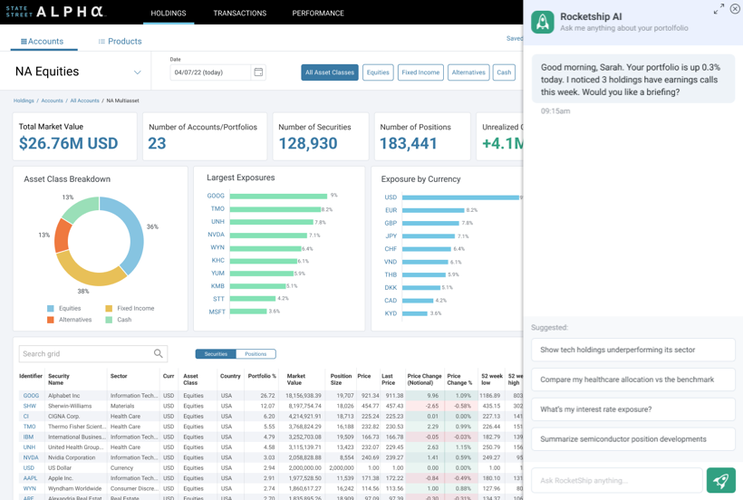
We then discussed and researched different AI modes, e.g. agentic vs copilot vs automation. The design intent was not to build a chatbot or accelerate existing workflows, but to introduce an agentic system capable of owning outcomes rather than tasks. Unlike automation, which requires predefined rules, or copilots, which depend on user prompts, the agentic AI operates with contextual awareness and goal alignment. It continuously monitors portfolio composition, market conditions, and risk exposure to proactively surface insights, anticipate analysis needs, and recommend next steps — while maintaining human authority over all decisions.
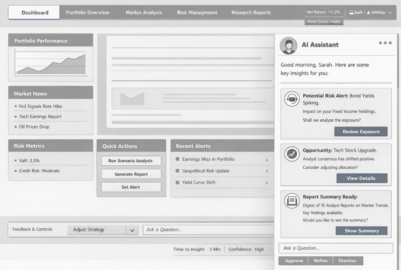
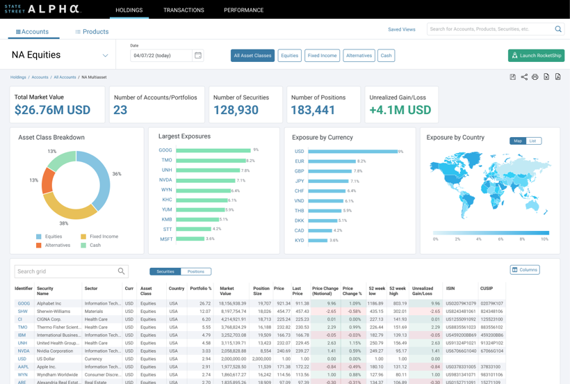
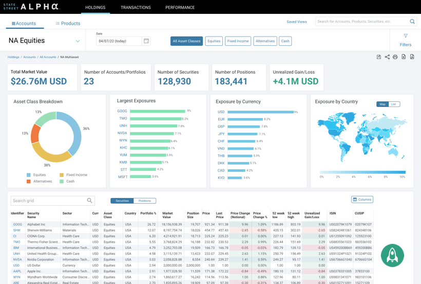
Wireframes were next, iterating on ways for the user to interact with the UI. Since the overall design was straightforward, we carried our iterations (and our disagreements!) into the Final UI. We wrestled mostly with where to put access to the agentic system. In the end, it was either a floating button or a CTA in the sticky nav up top. Multiple users expressed preference for the button in the sticky nav, so none of their data might be covered, and that's what we went with.
Continued Research
As great as AI is, how do we deal with some of its limitations? AI outputs are probabilistic, but users often interpret them as authoritative. Overconfidence — not inaccuracy — is the primary risk. How can UX deal with this? Instead of presenting recommendations as definitive, I suggested:
- Have insights include confidence indicators
- Use language that avoids absolutes (“likely,” “suggests,” “signals detected”)
- Show alternative scenarios when confidence is low
Other ideas include: making the reasoning inspectable - always citing sources for data; action-gating for any decision points, ensuring AI never makes an irreversible decision without human intervention; include feedback loops to help teach the agent to be better; and making sure any and all failure states are visible. A trustworthy system is one that fails visibly and predictably.
Final Result
In the end, the data and designs I provided were received enthusiastically, and as of this writing were headed to implementation.


